Introduction
This was originally part of a project submission for the Shopee Product & Design Challenge 2021.
Participants had about 12 days from the release of the design brief to conceptualize and come up with ideas
to improve the current Shopee app.
Now, unconstrained by a deadline and design specifications, I have decided to expand on the ideas my team
came up with (and of course, put it up here as part of my portfolio😁)!
About Shopee
Launched in 2015, Shopee has grown to become one of the leading e-commerce platforms in Southeast Asia and Taiwan. It boasts a wide selection of products, and offers an easy, secure, and fast online shopping experience for consumers (or at least that’s what Shopee says on their website).
User Research
To gain a deeper understanding of user needs, my team administered a survey to a sample size of 39 respondents, asking questions relating to their usage of e-commerce applications. Our sample focuses on Shopee’s target user group, mostly consisting of young adults in the 21-30 years old range.
-
The survey sought to:
- understand the average user behaviour and interactions with the Shopee app;
- find out why users might (or might not) prefer the Shopee app over other major e-commerce competitors (such as Lazada and AliExpress);
- identify common user pain points.
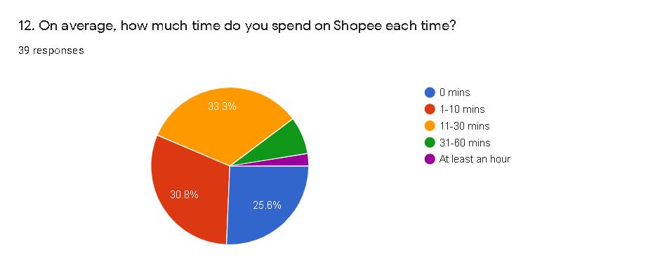
We discovered most survey respondents to be casual browsers, spending on average less than 30 minutes on the app each time.
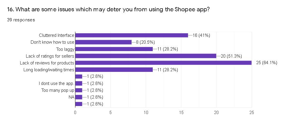
Some of the reasons cited for using Shopee include: convenience, low prices, and abundance of good deals. However, users also identified a few issues they were frustrated with: namely, the lack of reviews for products, lack of ratings for sellers, and a cluttered app interface.
User Persona and Journey Map
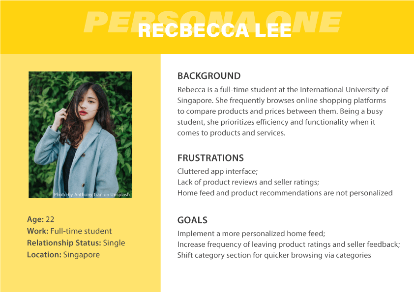
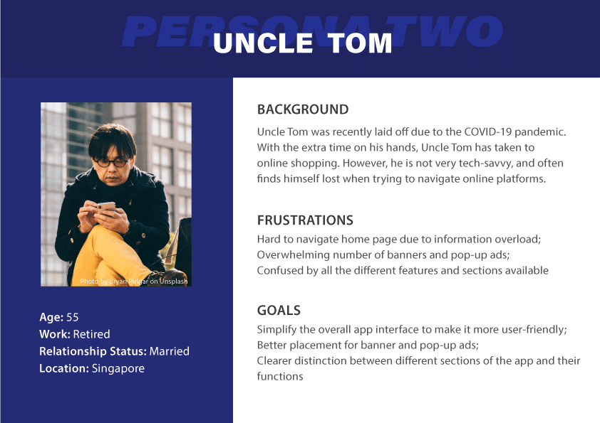
Based on the key findings gathered from our user research, I created 2 personas depicting a user’s behaviour and pain-points when using the app.
Problem Definition
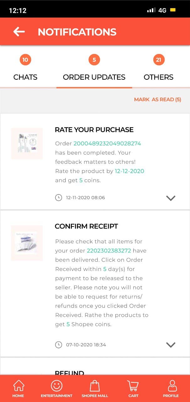
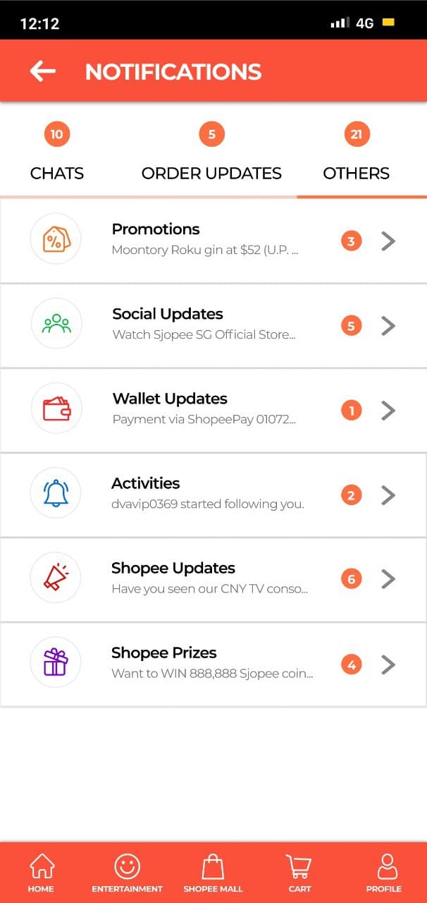
- Overly cluttered homepage
- Excessive ad banners interfering with browsing experience
- Too many different features and sections with no clear distinctions between them
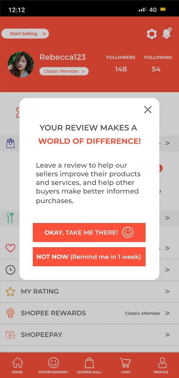
- Lack of product ratings and seller feedback
These pain points contribute to cognitive overload when a user first arrives at the homepage, overcomplicates the browsing process, and makes it harder for the user to make a purchase decision due to insufficient product reviews.
Proposed Improvements
- A more personalized homepage containing only the most important features and listings
- Strategically placed banners and pop-ups that do not overly intrude on a user’s browsing experience
- More user-friendly layout and neater categorization of features overall
- Rework reminder for users to leave product ratings and seller reviews
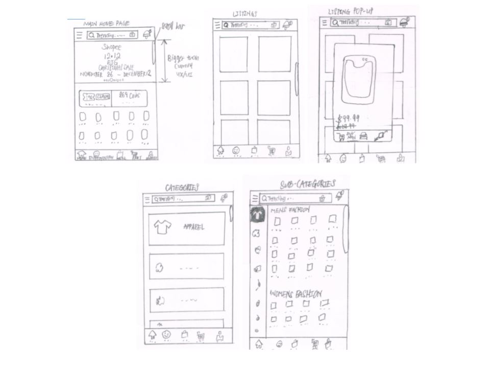
Lo-fi Design Mock-ups
After gaining a deeper understanding of common pain points and user needs, we fleshed out key design features to include and possible ways to incorporate them.
Here are some lo-fi mock-ups that one of my team members, Zheng Jie, sketched.
High Fidelity Prototyping
Armed with all of our research and brainstormed ideas, we then moved on to design a high fidelity version of our prototype on Figma.
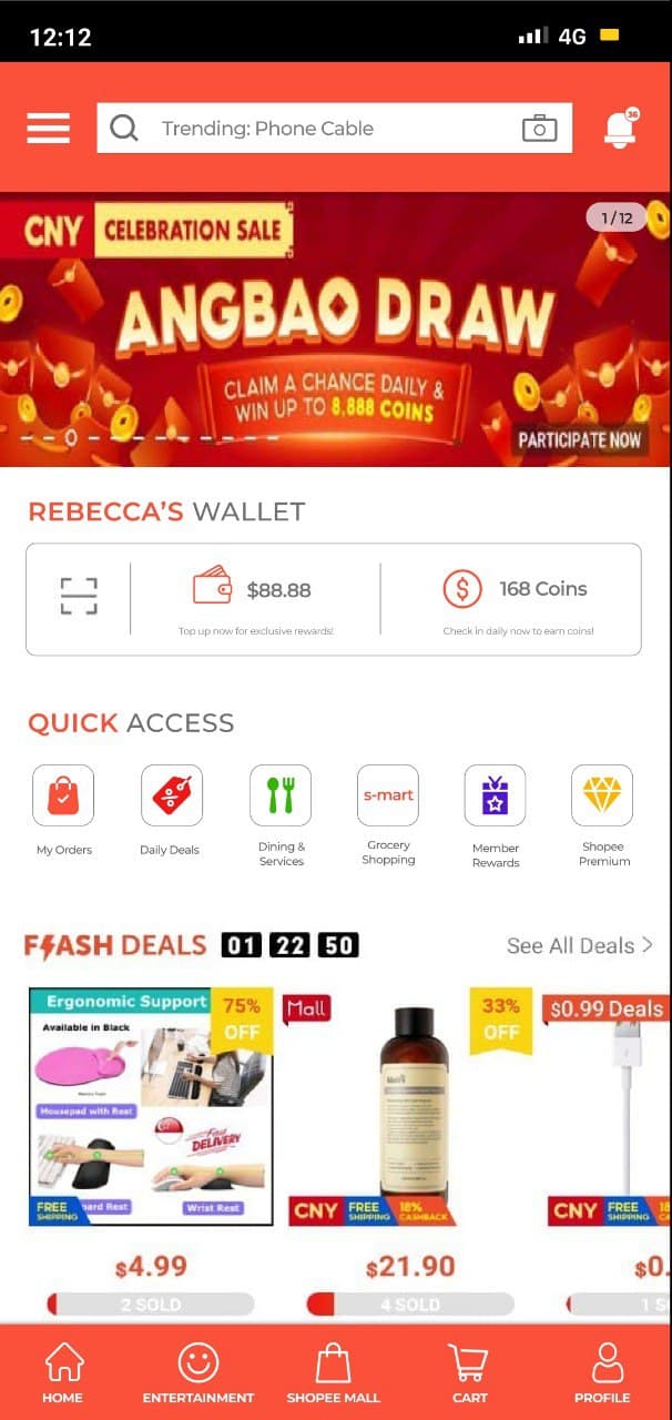
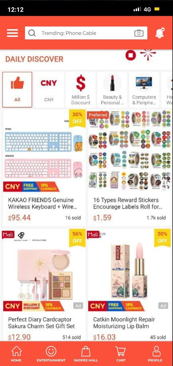
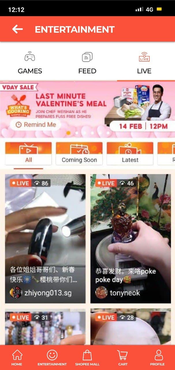
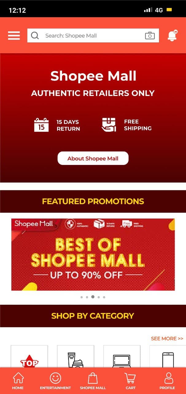
The original homescreen felt overly cluttered with advertisements, multiple quick access tabs, and
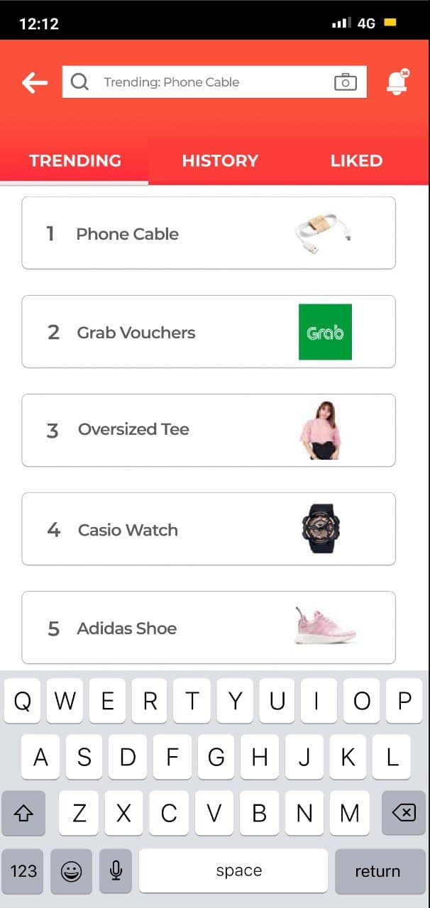
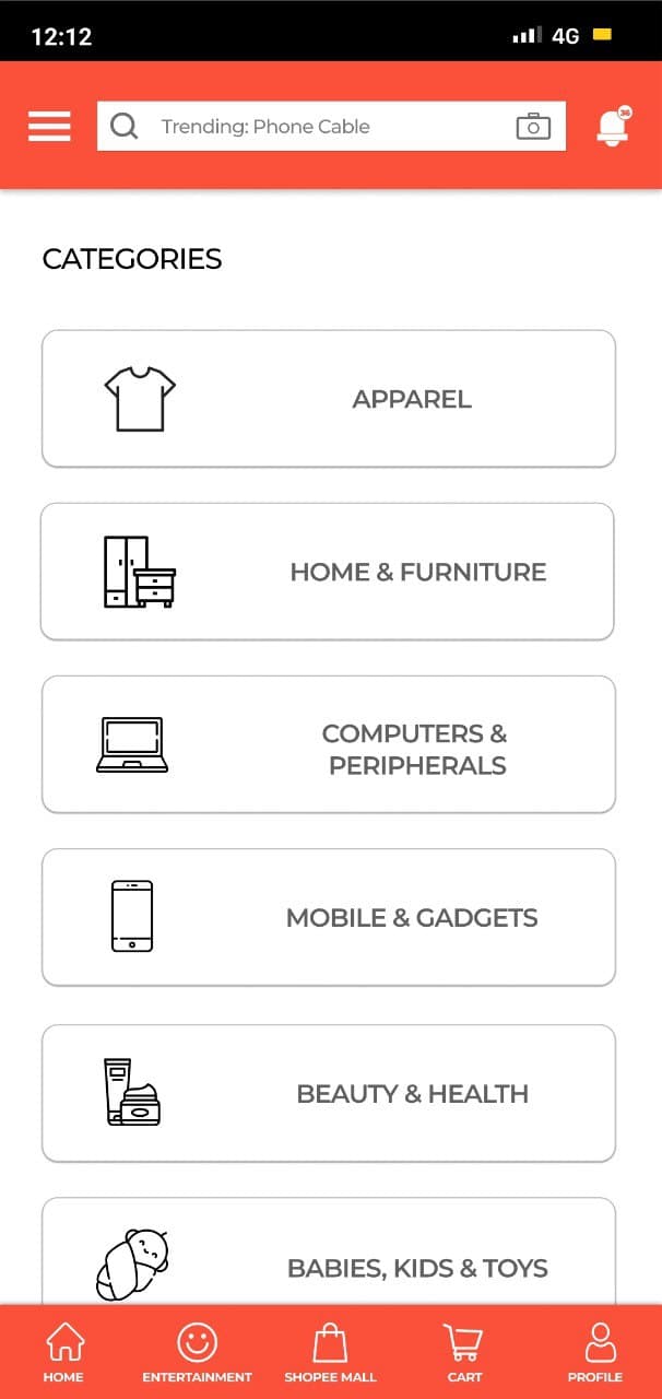
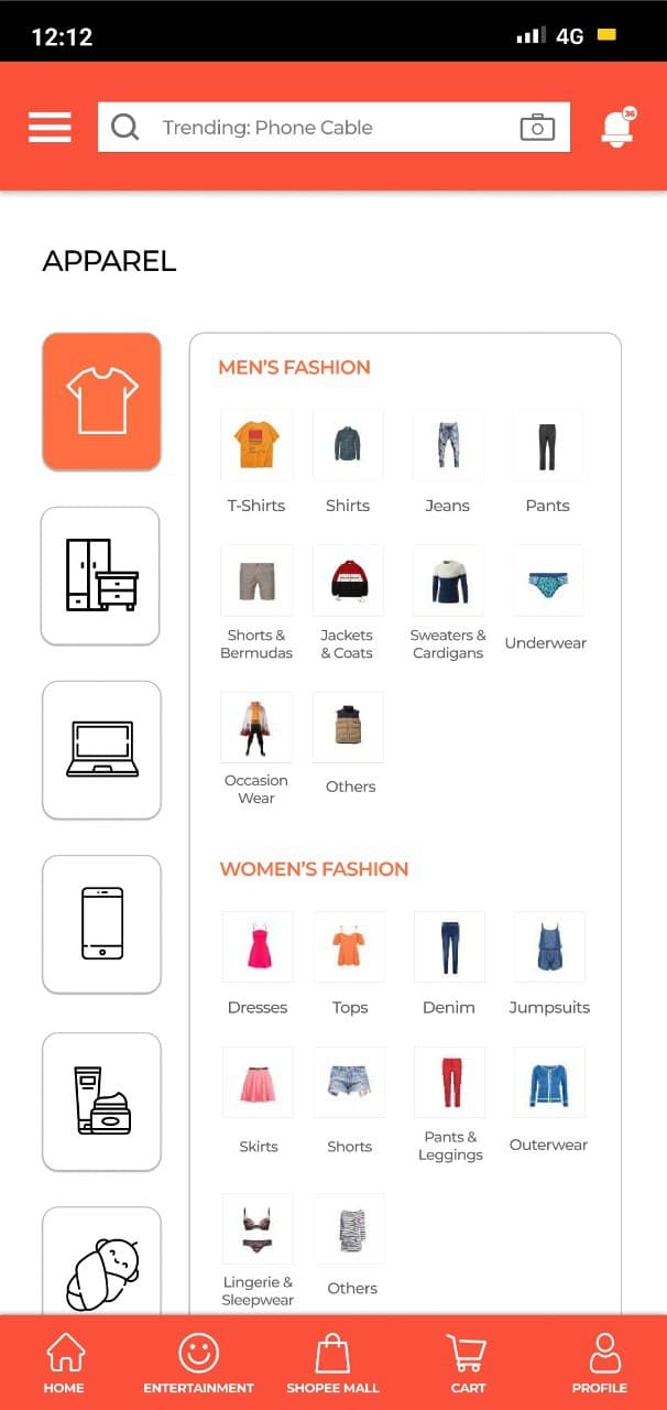
was inundated with various item listings hailing from different segments such as: "Fresh Deals Daily,
"Flash Deals", "Top Products", "Shopee Mall", "Dining & Services", "Trending Searches",
"Featured Collections", "Categories", and "Daily Discover".
In my design, I decided to retain only select segments which I thought were relevant and
belonged to the main feed, such as a consolidated section for banner ads, shopeepay wallet and coins
preview, quick access tabs, "Flash Deals" and "Daily Discover".
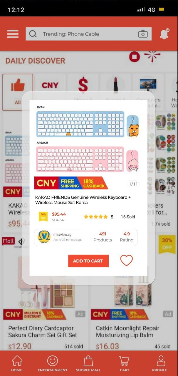
A new function proposed here is the pop-up overlay, which would allow the user to conveniently view key details
about a product such as product photos, name, price, rating and number sold, as well as seller ratings,
and to easily favourite or add the product to cart. According to our research data, these factors play a
prominent role in determining whether a user ends up purchasing a product, and thus, allowing users the
ability to quickly browse products they fancy, acquire relevant details, and add them to cart could
potentially drive up sales.
Finally, here's an interactive prototype that you can explore! It's a little small so I suggest using full screen mode for this.
Wrapping Up
It's been really fun working on this case study and I hope you have enjoyed reading this.
Attending the design workshops that Shopee partnered with to host has also allowed me to learn a lot
about UI/UX design processes.
Lastly, special thanks to my teammates Shi Min, Yeegin, and ZhengJie for undertaking this
journey with me :)