Aureus Trial Adventure
| Duration | Mid Feb 2023 - End Mar 2023 |
|---|---|
| My Role | Lead UI/UX Designer |
| Tools Used | Figma, LucidChart |

Introduction
Aureus Academy is a leading music school in Singapore, with over 18 outlets offering tailored one-on-one music lessons for students of all ages and skill levels.
Prospective students are able to sign up for a free trial lesson before committing to regular music lessons.
The Aureus Trial Adventure (ATA) is an initiative to digitalise and elevate the current classroom experience for trial music lessons.
Developed as a tablet application, v1.0.0 was released in April 2023 as a minimum viable product, featuring a set of basic but essential screens to help teachers better conduct their lessons in class.
My Role
I worked collaboratively with a team of around 20, including graphic illustrators, motion graphic designers, audio producers, and developers.
-
As the lead UI/UX designer, I:
- Gathered requirements and worked cross-functionally to understand and chart out lesson flows
- Designed UI elements and accompanying interactions for all screens
- Created a functioning prototype for a product demo
- Managed the consolidation of graphic assets across team functions, resulting in a more streamlined content upload process
- Took charge of design QA by reporting any discrepancies between what was built versus what was designed
Key Objectives
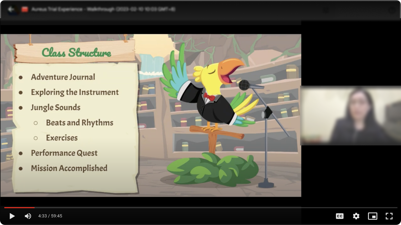
Before diving in, the team invited a training manager who is familiar with on-the-ground activities to give us a walkthrough of the current trial experience and answer any questions we had.
We gained a better understanding of the class structure and learned that in a single trial lesson, teachers had to switch back and forth between multiple mediums such as videos, printed booklets, and external websites, according to internal curriculum requirements.

- After getting to know some of the pain points teachers faced in conducting current trial lessons, we established several key objectives we hoped to accomplish with the app:
- To streamline the teaching process for teachers by consolidating multiple mediums onto one singular platform.
- To better engage young students aged 3-6 years old, who account for a major demographic, during the trial lesson.
- To foster a three-way interaction between the teacher, student, and app. The app should not take away from, but rather, complement the teacher's presence in the classroom.
Design & Development
Given the short timeline, we optimised the build process by constraining the designs to a set of reusable layouts to facilitate the ease of development and content management.
Initialization
Activity Introduction
At the start of each milestone, an information box appears along with one of our Aureus characters to introduce the upcoming activity to the student. The intention is to position the character as both a friend and a guide to the student to help ease them into the lesson activities, as opposed to having the teacher instruct them at every turn.
Teaching with Carousels
We needed a fun way to display a series of informational or instructional screens, and that's where the "carousel" layout comes into play.
The carousel layout is distinguished by its left and right arrows, which students can use to navigate to the previous or next in sequence in a series of related screens.
This breaks up the monotony of having to tap on the 'Next' button multiple times in a row whenever instructional screens (which young students usually associate with the word "boring"!) come up.
Engaging with Audio
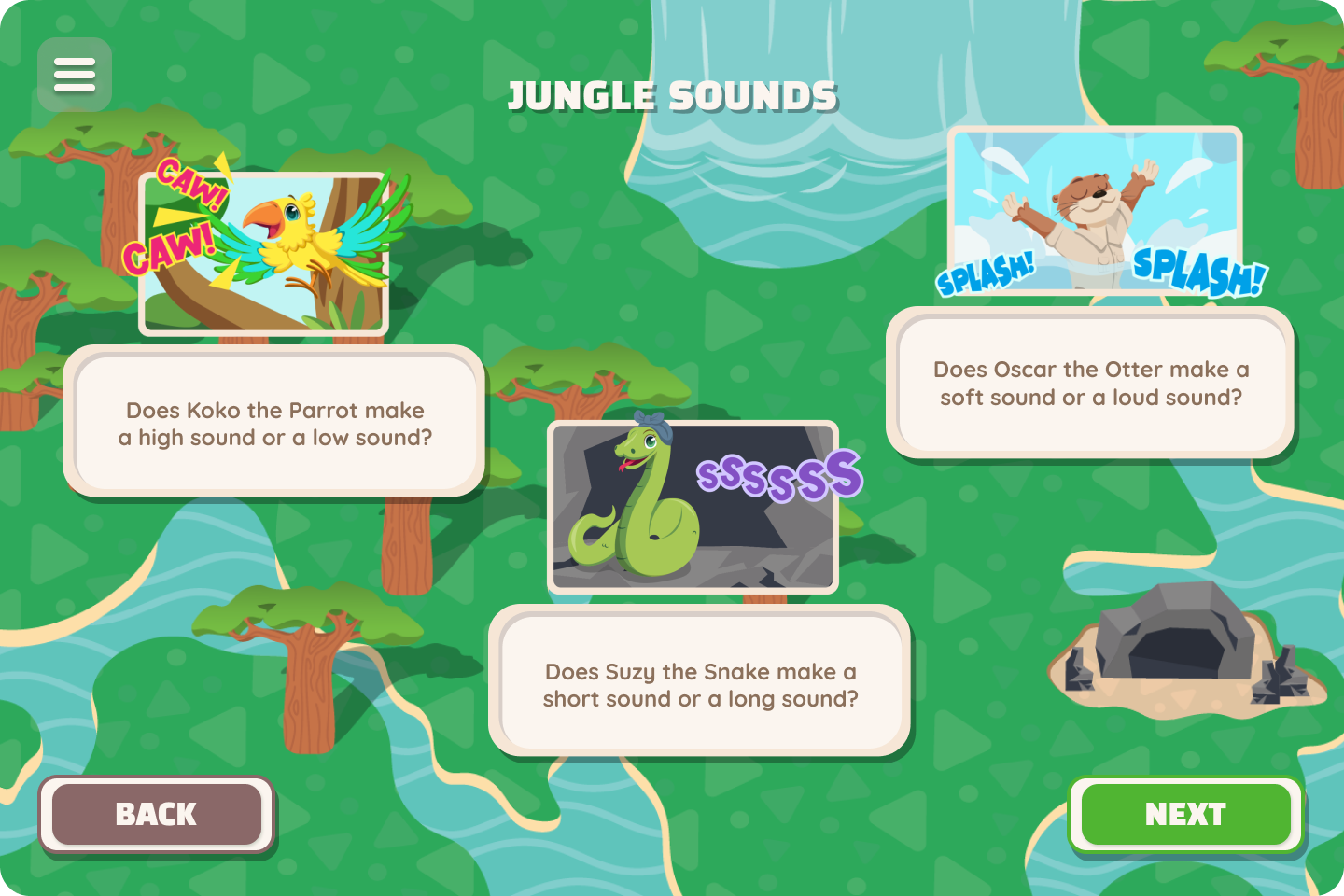
The Aureus team places great importance on creating immersive and engaging music experiences. The "audio card" layout features a few of our characters in their natural habitats, along with types of sounds that the students have to identity upon tapping on each card.

Learning with Videos
What good is theory without practice? After going through the necessary know-hows, students are given the chance to hone their practical skills by picking a song of their choice to play along.
"Great Job" Pop-ups
A little encouragement goes a long way! The pop-up layout is used for congratulatory messages that appear upon completion of a milestone activity. On top of providing segmentation in the flow, serving as an indicator that the current stage has ended and the next stage is about to begin, these pop-ups invoke in students a sense of achievement and fullfilment.
Report Card
At the end of their journey, teachers can evaluate the student based on their performance in various categories. A report card will be generated for each student as a keepsake of their experience with Aureus.
Concluding Thoughts
Borrowing from gamification theories, the team was able to experiment and create an engaging and delightful musical experience for young students dipping their toes into music for the first time.
The project concluded as a success with positive engagement and feedback from teachers, students and parents.
This has kickstarted plans to expand on the project to encompass not only trial lessons, but also normal lessons at Aureus Academy.